A research department turned into an economic news outlet
We transformed the CaixaBank Research website into a platform that shares knowledge drawn from economic research and analysis, organised for each reader.

CaixaBank's research department
CaixaBank Research has traditionally been CaixaBank's Research Department. Its mission is to create and share knowledge drawn from economic research and analysis: to stimulate debate and the exchange of experiences across every sector of society, and to bring the major issues of the socioeconomic environment within reach of as many people and companies as possible.
Making CaixaBank Research a reference in economic information
The starting point was the website of a research department, with the rigidity of a traditional service. The goal was different: to transform it into a platform that shares knowledge, able to integrate and organise a wide variety of content, personalise it for each reader and offer the best possible user experience.
All of this with the complexity, robustness and security a financial institution's website must have, and with an added difficulty: the profusion of data and charts that comes with any economic analysis.
A news outlet, not a departmental website
We started with conceptualisation: studying and understanding every interaction between the research department and each of its user types, to find the best solution. From there came the fundamental decision: the website would be a news outlet that integrates and organises content and personalises it for each reader.
In design, the new website had to move away from the rigidity of a traditional research department and convey innovation and dynamism. Following the bank's corporate lines, we added layers of colour that communicate immediacy, information, alerts and rigour. From the home page, it feels like entering an international economic news website.
In development, to the complexity, robustness and security a financial institution requires we added the challenge of making the user experience as friendly as possible with so much data. For that we chose a system of dynamic, highly visual charts the user can interact with.
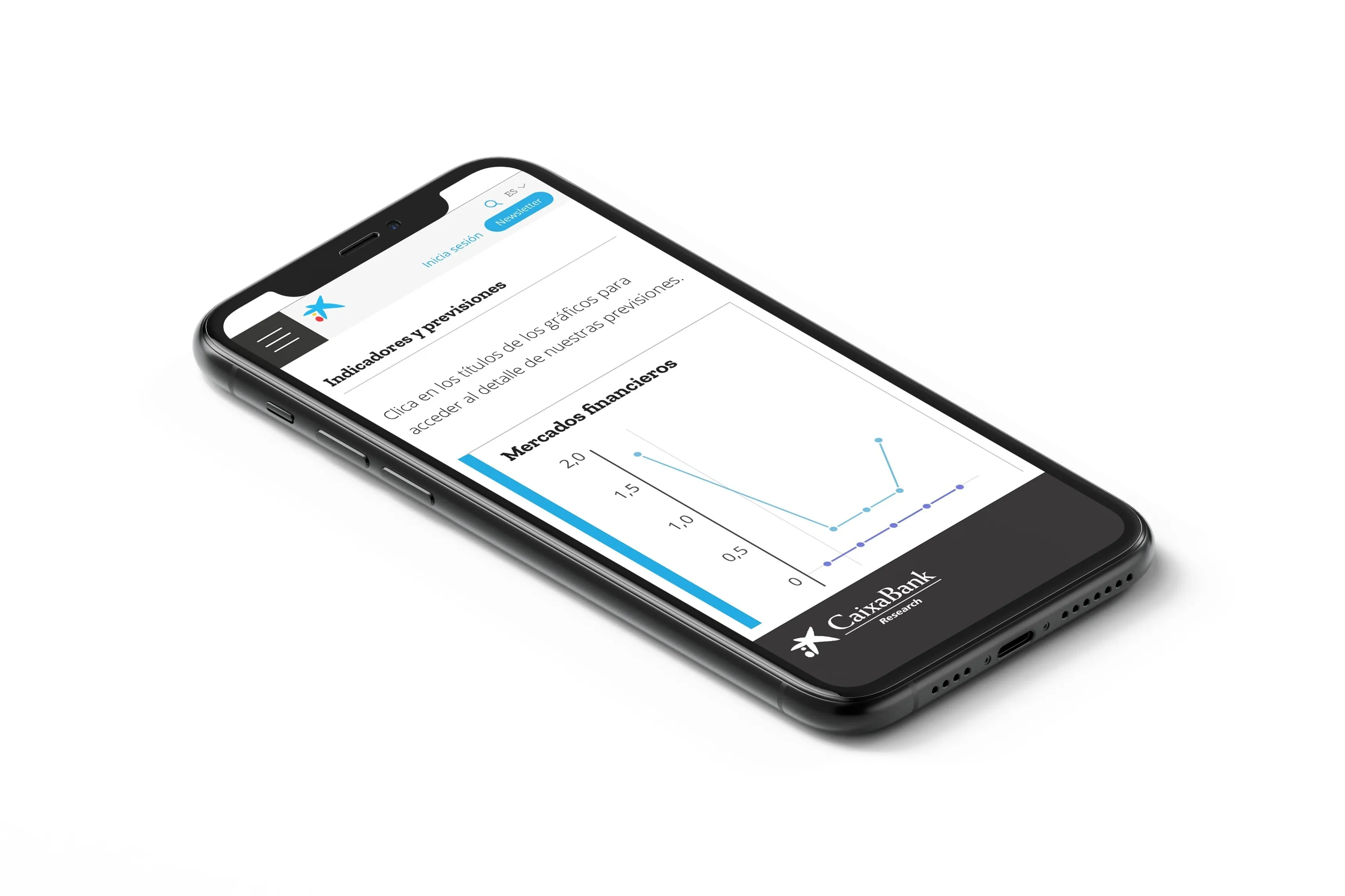
An economic news website
CaixaBank Research stopped being the website of a research department and became a news outlet: a platform that shares the knowledge of its team of economists, organised by topic, with content personalised for each reader and data that can be explored.
How it turned out.
The home page reads like a news outlet's: a menu by topic, the daily markets report and the day's analysis up front. Each analysis is presented as a piece of journalism: section, headline, standfirst, image and the economist's byline. The periodical publications, on coloured cards that set each series apart.
Keep looking.
¿EL SIGUIENTE CASO ES EL TUYO?
Hablemos