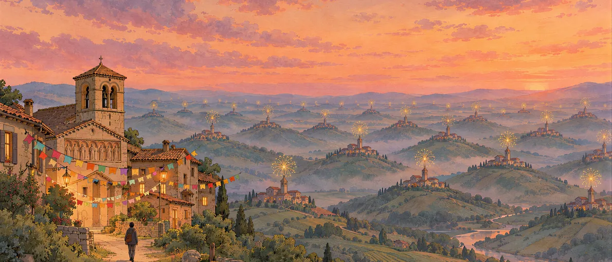
A brass band playing the same old tunes. Fireworks. Food and drink until you can’t take any more. All village festivals could look alike, but no local will ever accept that their town’s festival is the same as the one next door. Ah, but the posters… Town after town, the same poster: hyperrealistic render, golden sunset light, fireworks bursting over the bell tower, an epic-movie sky and figures with skin that is far too smooth. Lots of effect, lots of shine and not a single decision. Anyone who works in this field spots it a mile off and finds it ugly, even if the average neighbour thinks it looks spectacular.
The phenomenon is now big enough that Catalan broadcaster 3Cat asked in July whether AI is stealing the soul of festival posters, with cases like Ordis, in the Alt Empordà, where the poster was made with AI, animated and accompanied by a commemorative song. And town councils have started to react: in Tudela, the jury excluded the winning poster for the Santa Ana festivities in May after finding AI had been used, against the rules, and Zaragoza explicitly bans AI tools in the competition for the 2026 Pilar festival poster.
An averaging machine
What’s interesting is not that those posters are badly made. Technically, they’re well executed. The problem lies elsewhere. Generative AI works like a regression-to-the-mean machine: you ask it for something and it gives you back the centre point of everything it has seen. The most likely, the most accepted, the least risky. That’s why all the posters look alike, and why one town ends up with the same face as the next.
If you work in web or product, this will sound familiar. It’s exactly what is happening with interfaces. Any landing page built prompt by prompt comes out the same: violet gradient, glow behind the hero, bento grid, cards with the same radius, the same geometric sans with tight tracking and a “Get started” in a pill button. Startups in sectors that have nothing to do with each other, with interchangeable websites. The festival poster and the fintech landing page suffer from the same disease: nothing is wrong, but there’s nobody behind it.
Craft still counts, but it no longer sets you apart
And here it’s worth not drawing the wrong conclusion. That AI produces something correct doesn’t mean doing things well has stopped mattering. It matters more than ever: a grid that doesn’t hold, a contrast that fails, states nobody thought about or badly set type are still mistakes, and they now stand out more because the baseline has risen. What has changed is that craft is no longer enough to set you apart. Finish is the minimum, not the added value. Doing it well used to make you stand out. Now doing it well only puts you on the starting line.
A poster someone decided on
What gets you off that line lies somewhere else. In Sant Martí Sarroca, in the Alt Penedès, it’s the residents, not professionals, who make the poster every year. According to the same 3Cat report, this year it was made by Maria Rafecas, who is not a designer, and she drew on the permòdols, the medieval figures that decorate the 12th-century Romanesque church of Santa Maria. Next to a render with fireworks, her poster looks more modest. Less polished, even. And yet it has something the other one lacks: someone looked at their town, found something that only exists there and turned it into an image.
That’s what AI doesn’t do. It doesn’t decide, it averages. And the eye, even if it can’t explain why, notices the difference between something that has been decided and something that has simply been generated.
Product works the same way, only the decisions are of a different kind. Microcopy with its own voice instead of the usual filler. An illustration made for that product and not taken from a pack. An interaction that only makes sense because the user is who they are. A colour system that comes from the brand and not from the default theme. None of these is more “handmade” in the sense of texture, but all of them have someone behind them.
The imperfection trap
Be careful not to turn this into a recipe, because that’s where the trap is. If “human” becomes an aesthetic (paper texture, shaky lines, handwritten type, illustrations with imperfect strokes on a website), AI will learn it in two weeks. It already does. Ask it for “risograph style, handmade, imperfect” and it gives you just that. As soon as imperfection becomes a trend, it will become average too.
That’s why the answer lies not in texture but in specificity. What an AI can’t average out is whatever only makes sense for a particular place, particular people, a particular product. Figures carved into a 12th-century church are not in any dataset as a reference for a festival poster. Neither is knowing why your users drop out at step three.
Sourdough still has to be baked properly
Sisón Pujol, of ADG-FAD, the Catalan graphic design and visual communication association, believes AI will gradually make posters uniform and that a rebound effect will follow, and in the 3Cat report he compares it to local food and sourdough bread, which we now value. He’s probably right, and not only about posters. When everything comes out of the same industrial oven, what regains value is whatever tastes of somewhere. But sourdough bread still has to be properly baked.
What is human in design has never been the shaking hand. It has always been judgement: knowing what to look for, what to discard, when to stop and how to finish it well. AI has made that clearer than ever, because it has laid everything else bare.
What is human in design has never been the shaking hand. It has always been judgement: knowing what to look for, what to discard, when to stop and how to finish it well.
Sources
- Teresa Dalmau, 3CatInfo, La IA està robant l’ànima dels cartells de les festes majors?, 24 July 2026: the cases of Ordis and Sant Martí Sarroca and the remarks by Sisón Pujol (ADG-FAD).
- Orain, El jurado excluye al cartel ganador de las fiestas de Tudela por usar inteligencia artificial, 25 May 2026: exclusion of the winning Santa Ana festival poster after its author admitted using AI.
- Zaragoza City Council, El Ayuntamiento de Zaragoza lanza el concurso del cartel anunciador de las Fiestas del Pilar 2026, 12 February 2026: the rules ban the use of AI tools to create the entries.